
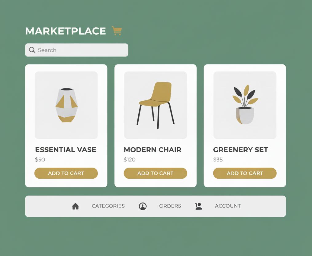
Your Shopify Storefront Craves Design Consistency, Here Is How To Create And Keep It
Imagine landing on a Shopify storefront in search of a new pair of sneakers. The homepage banner looks modern and polished, and the brand instantly feels trustworthy. But then you click into the product images, and things fall apart—one shoe is photographed on a white background, another on a rug in warm lighting, and a third outdoors on the pavement. The inconsistency makes the store feel disorganized, even unprofessional. Chances are, you’ll leave without buying.
This is why design consistency matters. In 2025, when Shopify storefronts compete with over 2.5 million active stores, visual uniformity isn’t just nice-to-have—it’s one of the biggest drivers of e-commerce growth. Research shows that consistent design can boost revenue by as much as 23%, while inconsistent product images and banners raise bounce rates and undermine trust. For busy e-commerce marketers and Shopify store owners who spend hours producing visuals for every campaign, the message is clear: consistency saves time, strengthens brand recognition, and drives conversions.
The hidden costs of inconsistent visuals
When your product images or banners don’t match, you’re unintentionally creating friction. For fashion brands, mismatched lighting can make a dress look navy blue in one photo and almost black in another. Customers order, receive something that feels different, and return it. Returns don’t just drain revenue, they weaken trust in your Shopify storefront.
One mid-sized cosmetics brand learned this the hard way. They hired multiple freelancers across different campaigns, each with their own style. Lipsticks varied slightly in shade depending on the shoot, and customers complained about color accuracy. Only after standardizing their photography: using identical lighting setups, editing presets, and file formats returned rates drop and repeat purchases climb.
And it’s not just about photography. Inconsistent banner generation is another silent killer. If one campaign banner uses clean typography and another swaps in a completely different style, your store starts to feel like it has multiple personalities. Instead of building a recognizable brand identity, you’re confusing customers who want a seamless experience.
Consistency is a system
The best Shopify storefronts don’t leave visuals to chance. They create repeatable systems that ensure every new banner, every campaign visual, and every product image feels like part of the same story. This means brand guidelines that define exact color codes, font hierarchies, grid layouts, and photo styles. When these systems are documented and embedded in your workflows, design becomes predictable, scalable, and reliable—qualities your customers notice.
Look at Gymshark, a Shopify success story. Whether it’s a product detail page, a homepage banner, or a seasonal campaign, their visual identity is unmistakable. The same clean typography, consistent photography angles, and precise brand colors carry through. Customers don’t have to “relearn” the store at each click, they recognize and trust it.
tip 1: Standardize your product photography
The first step to design consistency is locking down your product photography process. Instead of starting from scratch every time or relying on different freelancers, create a documented playbook. Define one background color, one lighting setup, and one set of angles, and stick to them.
Example: Allbirds keeps its product images simple and uniform. Every shoe is photographed against a clean white background, always from the same three angles. This consistency allows customers to compare products quickly without visual distractions, which builds trust and shortens the path to purchase.
For smaller stores, even photographing your products at the same time of day with consistent natural light can go a long way. The key is that your Shopify storefront should feel cohesive, not pieced together.
tip 2: Create templates for banner generation
Campaigns are where many Shopify store owners lose consistency. Holiday promotions, flash sales, and influencer drops often demand dozens of visuals in days. Without templates, you risk inconsistent fonts, layouts, or color choices—fracturing your brand.
Example: A Shopify jewelry brand that ran frequent Instagram ads used to design each banner from scratch. The result was a mismatched feed. They switched to a template system where all banners used the same grid, typography, and color palette. Production time dropped by 40%, and their ads started looking cohesive across platforms, reinforcing their identity.
For your store, invest a few hours upfront creating 5–6 banner generation templates for promotions, product launches, and social ads. Upload them to Image Dino and use for all occasions to create banners in bulk! Over time, these will save you days of work and guarantee consistency across campaigns.
tip 3: Audit your visuals quarterly
Even with systems in place, small inconsistencies creep in. A new designer uses a slightly different font, or a product shoot introduces a new background color. Left unchecked, these small deviations dilute your identity.
Example: Beardbrand, a grooming company on Shopify, audits its visuals every quarter. They check product images, campaign banners, and landing pages against their style guide and fix discrepancies. This ongoing discipline ensures their brand always feels sharp, even as new campaigns roll out.
For your storefront, set a recurring reminder every quarter to review visuals. Compare your product images and banners against your brand guide, and update anything off-brand. Over time, this consistency compounds into stronger recognition and trust.
Scaling visual consistency with the right tool
For Shopify stores with hundreds of SKUs or frequent promotions, manual consistency isn’t enough. Tools like Image Dino allow you to generate campaign banners in multiple formats from a single template—ensuring brand alignment while saving hours of work. You can edit and optimize thousands of images automatically, applying the same filters, background removal, and compression settings. For e-commerce marketers, these solutions mean consistency without the constant grind.
***
Consistency may feel like a design detail, but it’s a business driver. Customers who trust what they see are more likely to buy, stay longer on product pages, and come back. That trust compounds into e-commerce growth, because each campaign reinforces your brand instead of diluting it.
The most successful Shopify storefronts—from Gymshark to Allbirds to Beardbrand—didn’t get there by creating the most “creative” visuals each time. They got there by being consistent. Their product images feel reliable, their banner generation processes are systematized, and their storefronts tell the same brand story no matter where customers look.
For busy e-commerce marketers and Shopify store owners, the path is clear. Document your processes, create templates, use automation, and audit regularly. Do this, and design consistency stops being a time-consuming chore and starts being a growth engine for your brand.
In 2025, when competition has never been tougher, design consistency could be the simplest yet most powerful advantage your Shopify storefront can claim!
Set up your design and create dozens of product images for your Shopify storefront with Image Dino!